
Vidange
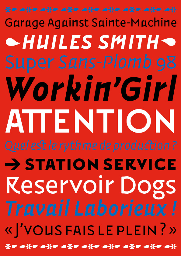
Well-oiled sans-serif
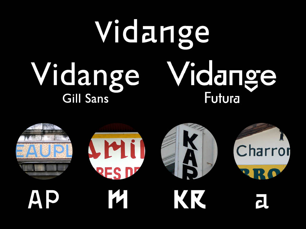
Vidange is an experiment of a bastard typeface. It’s an improbable mix between two typographic styles as compatible as water and oil. Like amateurish lettering that uses different alphabets patterns without too much concern about overall consistency, Vidange takes both from humanistic and geometric lineal references. Ones wonder if it was not drawn by the hidden son of Eric Gill and Paul Renner.
Designer → Jack Usine
Date → 2009
Styles → 8


